Basic exploratory data analysis and Simpson's Paradox
Reflecting back on last week, I spent 3 days on basic stats and 2 on the ML book. I'm really tempted to keep on 100% on the ML book, it's more fun :) But I believe having a strong foundation in probability and stats will be important in the long run as I get closer to the underlying stats for bayesian methods, graphical models etc. So I will resume with Stanford's online course and perhaps this week I will get far enough that it will begin to overlap with the All of Statistics book that I intend to work through along with some problem sets available online within some of the CMU probability courses (e.g here's one), which begins with random variables, conditional probability and Bayes' theorem.
The Stanford stats intro course is feeling borderline too elementary to bother with. However, I learn a couple of things here and there, and can move through it quickly, so I will continue on.
I also got the hang of IPython notebooks and some of the basic graphing functions from matplotlib. It's really a great tool and I'm really happy that Python / IPython / numpy / scikit-learn are among the most popular / powerful tools for data sciencey / ML stuff. On a related note, at the end of last week I picked up a couple of books: Fluent Python and Python for Data Analysis. The first has been great for getting reacquainted with Python and some of the newer features of Python 3 after being away from it for a few years in Ruby land—I used Python for Real Time Farms before joining Food52, a (mostly) Ruby shop. The second will help give a broad overview of numppy, pandas and a few of the other tools that will be used often in the ML book and in exploring stuff within IPython notebooks.
First impressions coming back to Python from Ruby: I love list comprehensions and slice syntax and have greater respect for the thought leaders in the Python community / find myself agreeing with the recommended way of doing things more often than with Ruby. But I'm already missing the symbol type (e.g for dictionary keys) from Ruby, as well as the block syntax that makes threading data through a series of transformations via the functions available for all enumerable types in the standard library so nice. I will have to see if I can find a way to make expressing such computations as palatable in Python as I get back in more deeply. The libraries available for Python for scientific computing seem to be superior, whereas the community around web development in Ruby is prolific if occasionally sloppy. Python is the obvious choice for ML studies even though it looks like I could force it with Ruby to a certain degree if I really wanted to.
EDA: examining relationships
Last week was all about exploring distributions of a single variable / feature. The next section is about examining relationships between two. I imagine this will be scatterplots, and eye balling whether or not there appears to be a linear relationship.
- independent variable aka explanatory variable
- dependent variable aka response variable
Concepts:
- Explanatory / response (aka independent / dependent) variables. This is the variable's "role"
- Classify two variable data analysis scenario by its role-type (e.g C->Q is categorical -> quantitative)
Techniques:
- Identify explanatory and response variables given a description of a study or question (e.g in "does IQ influence favorite music genre", "music taste" is the response variable)
- Identify role-response from two variable
- Visualize C->Q using side-by-side box-plots
- Examine C->C using tables and conditional percentages within explanatory variable values
- Examine Q->Q using scatter plots, placing explanatory variable on x-axis
- Examine a 3rd dimension on a scatter plot by labelling each point with its category
- Interpret the linear correlation two variables by looking at a scatter plot and the correlation coefficient. You should be able to get a sense of whether they are linearly related, and if so, whether it's a positive or negative relationship. The correlation coefficient quantifies the strength of the correlation as it's hard to assess this precisely by eye-balling it.
Role-type
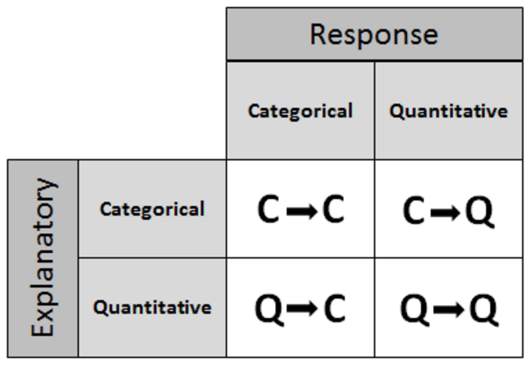
Two variable analysis can be classified by each of the variables type (categorical or quantitative) and which variable is the explanatory (independent) and which is the response (dependent):
- C->Q (categorical explanatory variable, quantitative response variable)
- C->C
- Q->Q
- C->Q
C->Q
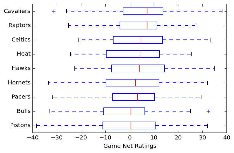
When examining how a categorical variable affects a quantitative variable, it's similar to comparing multiple quantitative variables, and using a side by side box-plots to compare their distributions is the way to go, one for each category. The example in the course is looking at how the type of hotdog influences the calorie count.
When I compared the distribution of margin of victory across 9 NBA teams in the eastern conference, that could be viewed as examining two variables: team (categorical) and margin of victory (quantitative).
C->C
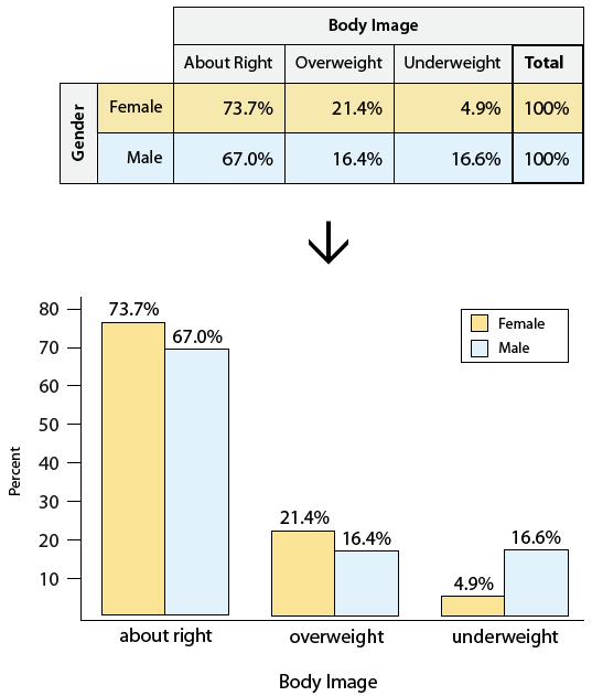
C->C can be examined with a 2 way table, rows are the explanatory, columns response, and each cell the value for that combination. The example in the course is examining the relationship between gender and body image (about right / overweight / underweight). The sum is provided for each row and column as well.
There may be a different number of data points available for each category, it's better to compare percentages than absolute numbers. In addition to the tabular form, visualizing these in a side-by-side bar chart helps too:
In choosing the percentages for each cell, the denominator should be the total for a given category of the explanatory variable. The course uses an example of looking at whether a student's smoking habits are influenced by their parents'. Here are the numbers:
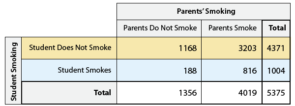
In order to see how the parents' choice influences their children, you want to show the percentages within each column (or "conditional column percentages")
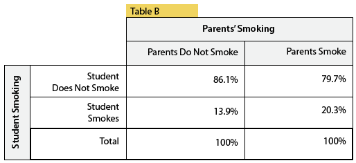
This allows one to quickly see that children of smokers are much more likely to smoke (20% vs 14%).
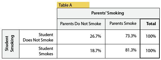
Showing conditional row percentages isn't as useful as it's reversing the supposed affects (how much more likely is a parent to smoke given their child does):
WRONG
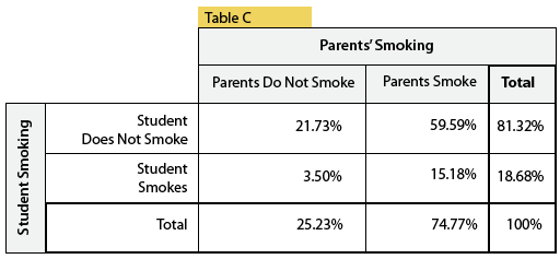
And showing percentages by dividing by the total number of students misses the point completely:
WRONG
This also seems to me like the first foray into conditional probability; in these cases we're looking at what is the probability of an outcome of the response variable given a particular outcome of the explanatory variable.
Q->Q
When examining Q->Q relationship, we make a scatter plot with the explanatory variable on the horizontal x-axis. Similar to how we examine a distribution for a single variable: its shape, center, spread, and identifying outliers, we examine the scatterplot with an eye towards:
- direction: positive, negative?
- form: does there appear to be a relationship? Is it a linear or curve-linear one?
- strength: how strong? e.g how tightly do the points fit the general line?
- identifying outliers: which points do not match the overall relationship?
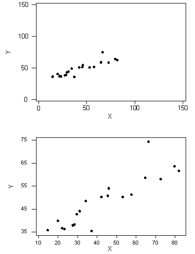
Here's an example plot examining age and how far from a sign an individual can be and still read it:
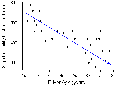
It has a moderately strong negative linear relationship and there don't appear to be any outliers.
In addition, you can examine another categorical variable atop a scatter plot by labeling it. Here's an example comparing two quantitative variiables, sodium and calories, and labeling them by category (meat, beef or poultry):
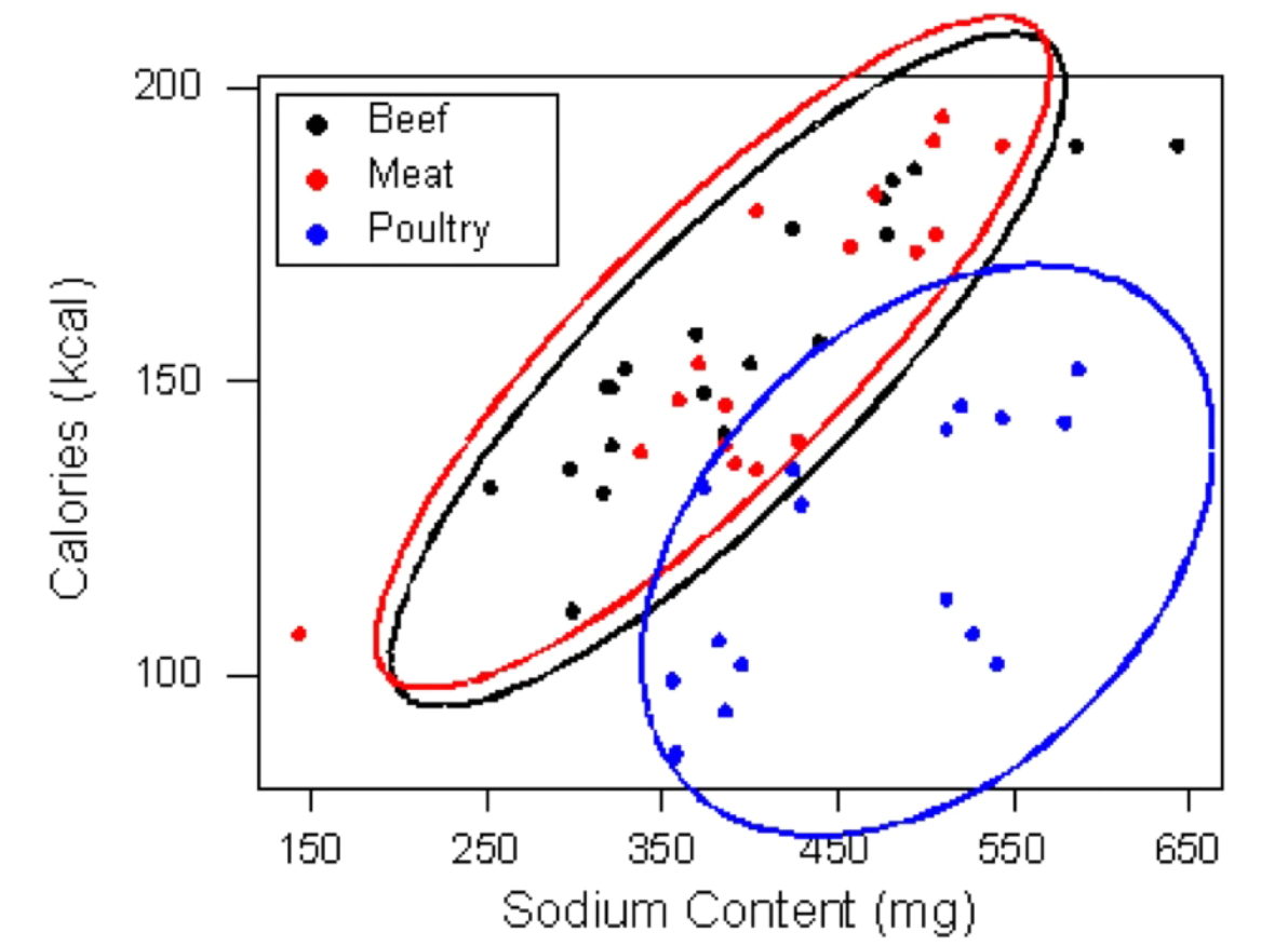
Side note: labeled scatter plots are common in the ML book as you are trying to learn a function that will recognize the labels and a 2-d plot is great for building intuition (even as in practice you are working with many more features).
Linear relationships
Examining the strength of a linear relationship by eye balling a scatter plot is tough; for example the same data set viewed at different resolutions can look "stronger" to our eyes because it bunches together more closely.
Instead we can look at a data set's correlation coefficient (r), which is calculated by taking the average of a pairwise computation of the two data sets, multiplying:
((xi - x_avg)/std_dev_x) * ((yi - y_avg)/std_dev_y))
For a given xi, we're looking at how much it deviates from the mean divided by the standard deviation which scales its deviation. A given xi should deviate from its mean by the same amount of the corresponding yi for xi and yi to be correlated.
The value ranges from -1 to 1, -1 being a very strong negative relationship, 0 being no relationship, 1 being a strong positive relationship.
Some things about r:
- r is a unitless value.
- it only measures the strength of linear relationships; a perfectly fit quadratic will appear to have a weak linear relationship. So if r is 0, it only means the two variables have a weak linear relationship and it says nothing about general correlation.
- similarly, a value of r close to 1 or -1 is not sufficient to say the relation ship is linear; it could also be curve-linear (side note, "curve linear" seems like a hand wavy concept and I'm looking forward to getting more sophisticated)
- outliers can quickly take down r
Linear regression
The correlation coefficient is clearly limited, instead we can find the best fit line for a data set that minimizes the squared error. We can use this line / function to predict the value of the dependent variable for a given hypothetical value for the predictive variable.
The course runs through a review of algebra, slope intercept etc. Once you have the slope and intercept of the best fit line, you can use it to predict values of y for the x etc.
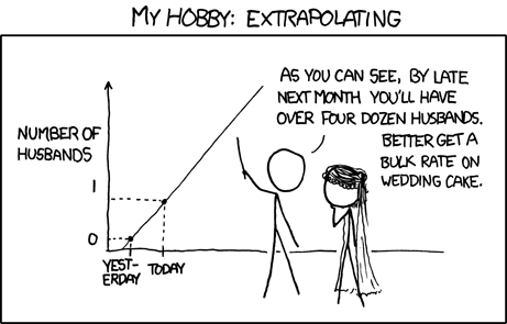
Important note: it is only considered prudent to predict values for inputs within the range of data used to compute the best fit line; e.g if your data set is looking at the ability to read a sign from a distance given age, and your data has entries for people ranging from 15 to 45, it is bunk to extrapolate and predict the distance of viewing for someone how is 60.
Interpolation is ok, extrapolation not so much. Obligatory XKCD reference:
Correlation
Yes correlation does not imply causation blah blah, there could be another "lurking" variable underlying the relationship. A scatterplot that shows clusters of data may indicate there's another variable that is important for understanding your data or that would have a higher correlation with your response variable.
Simpsons paradox
Adding in the lurking variable can reverse the previous direction of the association. That is, if you are looking just at A vs B (say, graduation rate vs college), you might see that people who attend one college (let's say MSU) have a higher graduation rate than another (let's say University of Michigan). It's possible that if you segmented the data by major, that in every single major, the graduation rate at umich is higher than MSU, even if the overall graduation rate at MSU is higher. This would be an instance of Simpsons Paradox, and underscores the danger of presuming causation.
Here's a nice clean example from the wikipedia article.
Adding in another variable can also help us deepen our understanding of a relationship even if the direction of the relationship does not change.
IPython todos:
- show a table with percentages
- scatter plots
- labeled scatter plot
- plot least square regression line